
The success of a website depends on striking design, a user-friendly experience, and high-quality content. All of these elements benefit greatly from choosing the right typefaces to improve readability and visual appeal. Fonts set the overall tone of a site, highlight content, and convey brand personality. Selecting the right fonts—those that capture attention and encourage users to read more—can increase traffic and help visitors spend more time on your site.
Fonts are fundamental components of web design. The right choice improves site performance in search and usability, enhances readability, and elevates the user experience. In this article, we examine the best fonts for websites, practical usage tips, and accessibility considerations to help you make informed typography decisions.
1. Why Font Choice Matters
Typefaces influence a website’s mood and perceived credibility. Proper font choices help users engage with content, improve comprehension, and reflect the brand’s voice—whether that voice is professional, friendly, modern, or traditional.
1.1. Readability
Fonts directly affect how easily your audience can read text. Choose clear, well-spaced typefaces for body copy and ensure sizes, line-height, and contrast support comfortable reading across devices.
1.2. Brand Identity
Fonts communicate personality. The combination of typeface, weight, and letterforms helps define your brand tone—playful, authoritative, minimalist, or elegant—so choose fonts that align with your identity and messaging.
2. Popular Web Fonts for Websites
2.1 Arial
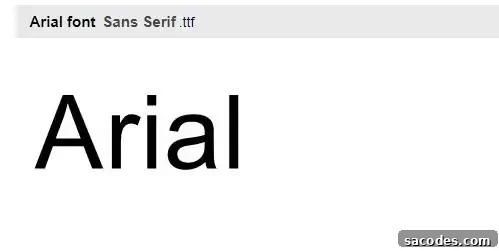
First released in 1982, Arial’s clean, neutral lines make it a reliable choice for text-heavy sites. Arial renders clearly on a wide range of screens and remains a practical, web-safe option for paragraph text and simple interfaces.
2.2 Arimo–Helvetica
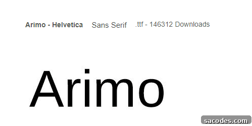
Helvetica and its modern alternatives like Arimo provide a clean, professional aesthetic. Widely used by major brands, these sans-serifs offer excellent clarity for headings and interface text where a neutral, sophisticated look is desired.
2.3 Georgia
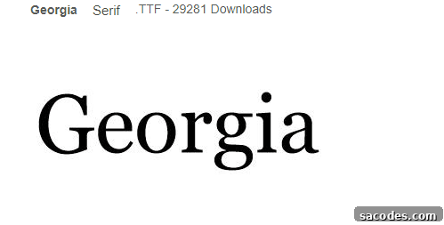
Georgia is a serif font designed for on-screen readability. It works especially well for blogs, news sites, and long-form content, delivering a classic, readable appearance that enhances the flow of paragraphs.
2.4. Roboto
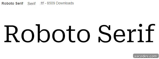
Developed with digital interfaces in mind, Roboto combines geometric forms with friendly curves. It is a great choice for technology blogs, e-commerce sites, and apps where a contemporary, clean look and solid readability are priorities.
2.5. Open Sans
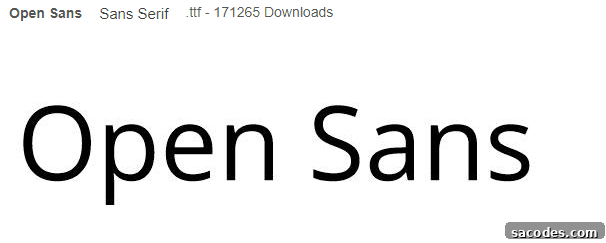
Open Sans is known for its open shapes and approachable tone. It provides excellent legibility for body copy and is a strong all-around choice for content-rich sites and long articles.
2.6. Lato
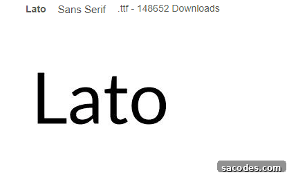
Lato offers a polished, contemporary look with slightly rounded letters. It is popular for portfolios and business websites that want a professional yet friendly appearance.
2.7. Montserrat
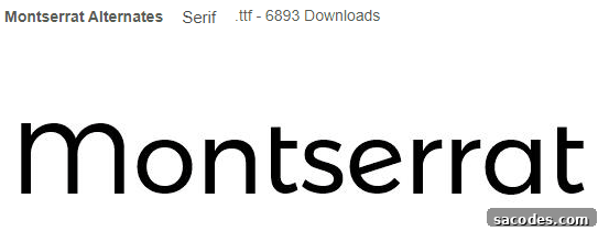
Montserrat is a geometric sans-serif that excels in headlines, short blocks of text, and branding. Its strong presence makes it suitable for titles and calls to action where visual impact matters.
How to Use Typefaces Effectively
Choosing fonts is only the first step—how you apply them determines their effectiveness. Consider performance, accessibility, and visual hierarchy when implementing typography.
3.1. Font Pairing
Combine fonts thoughtfully: pair a neutral sans-serif for body text with a distinctive serif or display font for headings. Aim for contrast in tone and weight while keeping overall harmony. Limit your site to two or three complementary families to maintain consistency and faster load times.
3.2. Font Size, Line Height, and Color
Legibility depends on appropriate sizing, spacing, and contrast. Base body text around 16px for desktop as a starting point, with larger sizes for headings. Use line-height (1.4–1.6 for body text) to improve readability. Ensure text color and background provide sufficient contrast to meet accessibility standards—this benefits all users and improves SEO by reducing bounce rates.
3.3. Performance and Loading
Web fonts can impact page speed. Use only the weights and character sets you need, choose modern formats like WOFF2 when possible, and implement font-display strategies (such as swap) to avoid invisible text during load. Also include reliable fallback fonts in your CSS stack to preserve layout and readability while fonts load.
3.4. Accessibility and Internationalization
Consider legibility for users with low vision, dyslexia, or on small screens. Select fonts with distinguishable characters (e.g., clear differences between I, l, and 1). If your site targets multiple languages, ensure chosen fonts support the required character sets and accents. Always check licensing terms before embedding commercial fonts.
Good typography strengthens user experience, readability, and brand recognition. Fonts such as Arial, Helvetica/Arimo, Georgia, Roboto, Open Sans, Lato, and Montserrat provide a versatile foundation for modern web design. Remember: beyond selecting fonts, thoughtful pairing, sizing, accessibility, and performance optimization are key to creating an effective and engaging website.